Branding
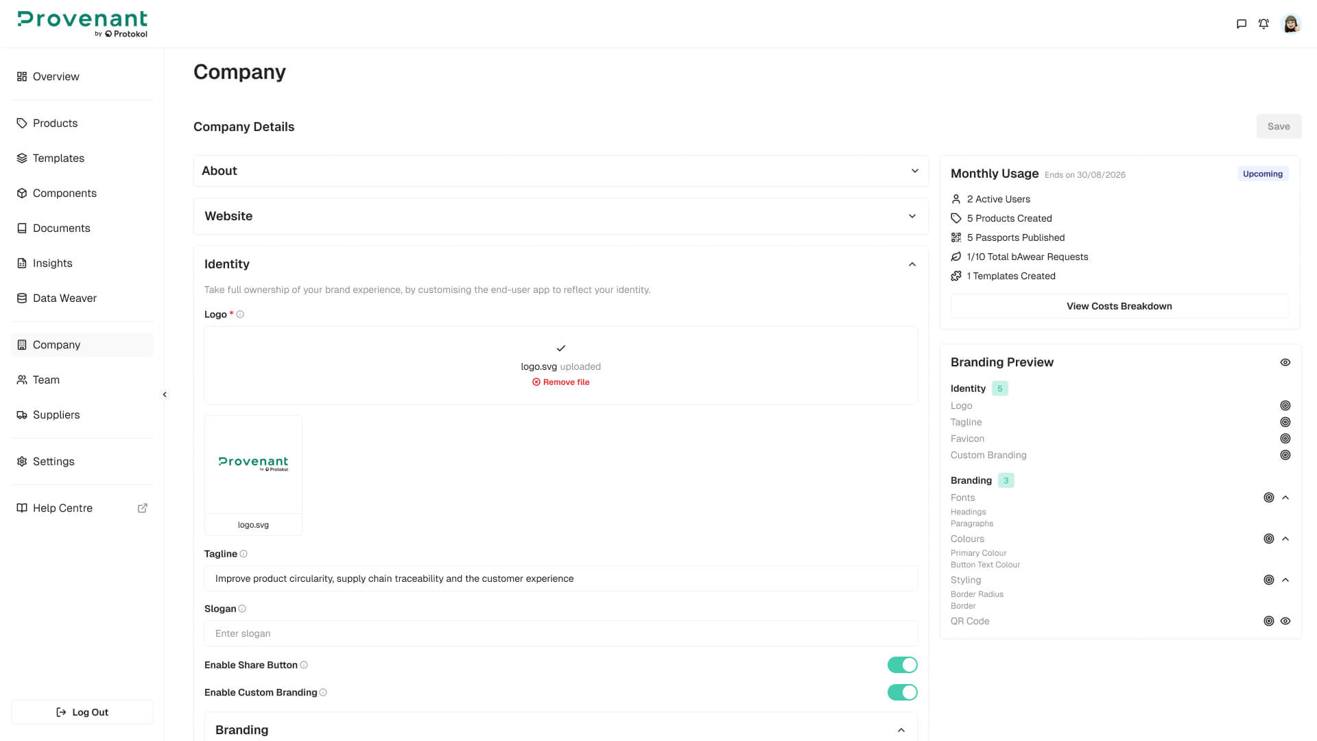
Use Company › Branding to define the visual identity of the end-user DPP experience. From this screen you can configure your logo and identity text, typography, colours, layout styling, and the appearance of the QR codes generated for your DPPs. Branding settings apply at company level and are reflected in newly generated DPPs.
Steps
- Open
Company›Brandingfrom the left navigation. - Toggle
Enable Custom Branding ONto reveal all configuration fields. - Configure the fields you need (see Available fields below). Use the
live previewon the right to validate the result as you edit. - Click
Saveto apply the changes.
Available fields
Branding fields are organised into the following groups. Each field has a Reset button that restores its default value, and changes are only persisted when you click Save.
Identity
| Field | Description |
|---|---|
| Logo | Upload your brand logo, preferably as a transparent PNG or SVG. |
| Favicon | Icon shown in the browser tab when the DPP is opened. |
| Tagline | Free text shown in the DPP header area below the brand logo. |
| Slogan | Free text shown near the tagline for supporting brand messaging. |
| Enable Share button | Toggle that shows or hides the share button in the end-user DPP view. Defaults to enabled. |
Fonts
| Field | Description |
|---|---|
| Headings | Dropdown to choose the font used for headings across the DPP. |
| Paragraphs | Dropdown to choose the font used for body text. Non-system fonts are loaded dynamically. |
| Paragraphs Line Height | Cozy, Normal, or Relaxed line spacing for body text. |
Colours
| Field | Description |
|---|---|
| Primary Colour | Used for accents, tabs, links, and active indicators. Set via colour picker or HEX code. |
| Headings Colour | Applied to all heading text in the DPP. |
| Button Text Colour | Applied to button labels. |
Styling
| Field | Description |
|---|---|
| Corner Radius | Controls the rounding of section cards, panels, and images. |
| Sections Appearance | Outline, single line, or no border for section cards. |
QR Code
| Field | Description |
|---|---|
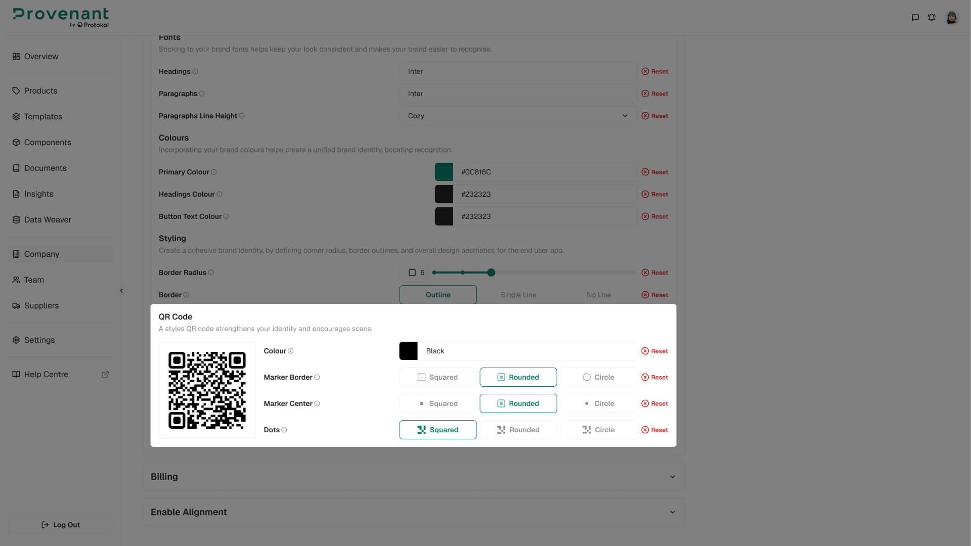
| Colour | Hex colour applied to the QR dots. |
| Marker border | Squared, Rounded, or Circle outer marker shape. |
| Marker center | Free text shown in the DPP header area below the brand logo. |
| Slogan | Squared, Rounded, or Circle inner marker shape. |
| Dots | Squared, Rounded, or Circle dot style. |
Live preview
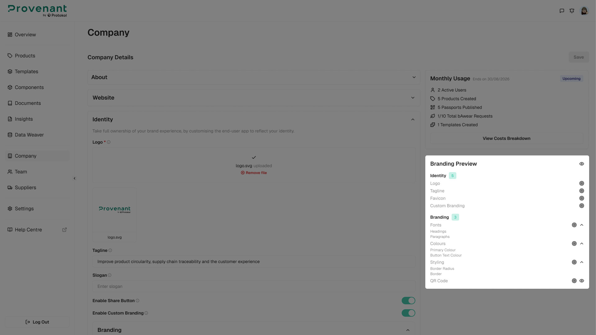
A live Branding Preview panel is displayed on the right side of the Company Details screen and updates in real time as you edit. It is organised into two sections, each with a count badge of configured fields:
Identity– Logo, Tagline, Favicon, and Custom Branding.Branding– Fonts (Headings, Paragraphs), Colours (Primary, Headings, Button Text), Styling (Corner Radius, Sections Appearance), and the QR Code preview.
Each row shows a filled indicator when the field has a value, and an empty indicator when the default is used. Sections are collapsible independently.
QR code preview
A live QR preview inside the Branding Preview panel renders a sample QR using your current QR Colour, Marker border, Marker center, and Dots settings. The preview uses a placeholder URL, so no real DPP link is required to validate the visual.
Full DPP Preview
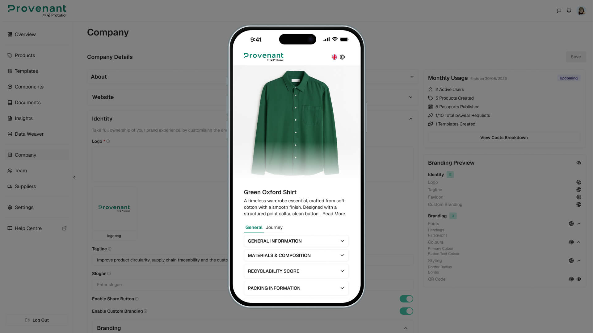
Use the eye icon at the top of the Branding Preview panel to open a full DPP Preview. The preview is a mobile-framed simulated DPP page that reflects all currently configured branding settings (logo, fonts, colours, styling, tagline, slogan) before you save. The preview uses a fixed demo product and is read-only.
How branding is applied
- Branding (including custom QR settings) is applied
automaticallyto newly generated DPPs. - To apply updated branding to an already-published DPP, unpublish the model and publish it again — the QR code and DPP link remain the same.
- If a field is not set, the platform falls back to the system default for that property.
- Per-template or per-product
QR customisationis not supported in this version (branding applies at company level only).